グラフの描画(Matplotlib)
import matplotlib
import matplotlib.pyplot as plt
import numpy as np
基本(プロット)
# 2019年の東京の最高気温 (h) と最低気温 (l) の月ごとの平均
x = [1, 2, 3, 4, 5, 6, 7, 8, 9, 10, 11, 12]
h = [10.3,11.6,15.4,19.0,25.3,25.8,27.5,32.8,29.4,23.3,17.7,12.6]
l = [1.4,3.3,6.2,9.2,15.3,18.5,21.6,25.2,21.7,16.4,9.3,5.2]
Matplotlibを利用する上で基本となるオブジェクトは以下の3つ.
plt: matplotlib.pyplotモジュールの別名(慣習でpltがよく用いられる)fig: グラフ全体を管理するFigureオブジェクトax: ひとつのプロットエリアを管理するAxesオブジェクト
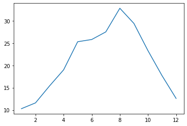
axオブジェクトのplot関数に\(x\)軸と\(y\)軸の値を渡すとプロットされる.何も形式を指定しないと,線グラフとなる.
fig, ax = plt.subplots()
ax.plot(x, h)
plt.show()
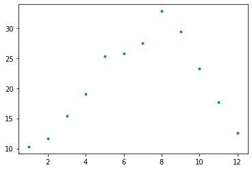
plot関数の第3引数に'.'を指定すると,データが点としてプロットされる.
fig, ax = plt.subplots()
ax.plot(x, h, '.')
plt.show()
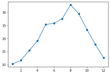
plot関数の第3引数に'o-'を指定すると,データが大きめの丸としてプロットされ,その間が線で結ばれる.
fig, ax = plt.subplots()
ax.plot(x, h, 'o-')
plt.show()
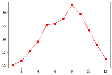
色を赤(r),点を四角(s),線を破線(--)でプロットする例.
fig, ax = plt.subplots()
ax.plot(x, h, 'rs--')
plt.show()
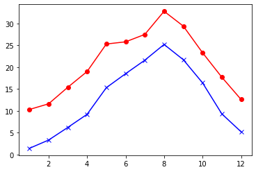
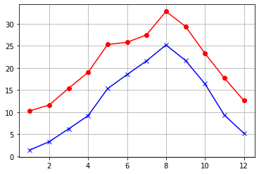
最高気温(h)と最低気温(l)をひとつの領域にプロットする例.
fig, ax = plt.subplots()
ax.plot(x, h, 'ro-')
ax.plot(x, l, 'bx-')
plt.show()

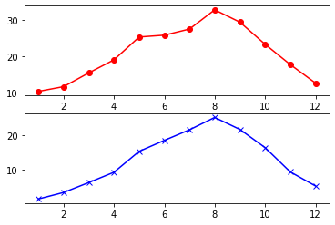
subplots関数の引数でグラフを2つのプロットエリアに縦に分割し,最高気温(h)と最低気温(l)をプロットする例.
fig, (ax1, ax2) = plt.subplots(2, 1)
ax1.plot(x, h, 'ro-')
ax2.plot(x, l, 'bx-')
plt.show()
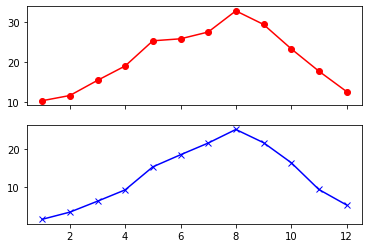
グラフを2つのプロットエリアに縦に分割したとき,\(x\)軸を共有する例.
fig, (ax1, ax2) = plt.subplots(2, 1, sharex=True)
ax1.plot(x, h, 'ro-')
ax2.plot(x, l, 'bx-')
plt.show()
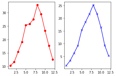
グラフを2つのプロットエリアに横に分割し,最高気温(h)と最低気温(l)をプロットする例.
fig, (ax1, ax2) = plt.subplots(1, 2)
ax1.plot(x, h, 'ro-')
ax2.plot(x, l, 'bx-')
plt.show()
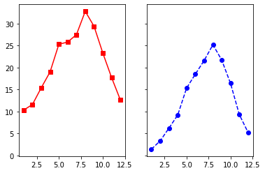
グラフを2つのプロットエリアに横に分割したとき,\(y\)軸を共有する例.
fig, (ax1, ax2) = plt.subplots(1, 2, sharey=True)
ax1.plot(x, h, 'rs-')
ax2.plot(x, l, 'bo--')
plt.show()
グラフの見た目の変更
見た目を変更する前のグラフ.
fig, ax = plt.subplots()
ax.plot(x, h, 'ro-')
ax.plot(x, l, 'bx-')
plt.show()
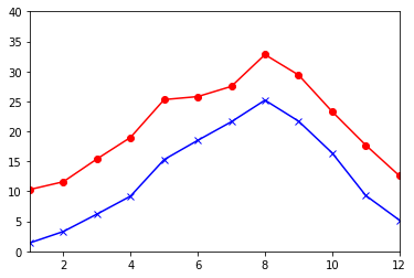
set_xlim関数とset_ylim関数で,\(x\)軸と\(y\)軸の範囲を指定.
fig, ax = plt.subplots()
ax.plot(x, h, 'ro-')
ax.plot(x, l, 'bx-')
ax.set_xlim(1, 12)
ax.set_ylim(0, 40)
plt.show()
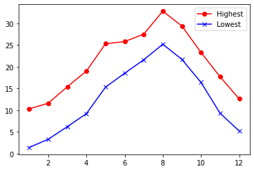
plot関数のlabel引数と,legend関数で凡例を表示(凡例の表示位置などは,legend関数の引数で制御できる).
fig, ax = plt.subplots()
ax.plot(x, h, 'ro-', label="Highest")
ax.plot(x, l, 'bx-', label="Lowest")
ax.legend()
plt.show()
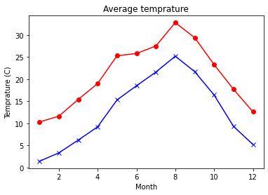
set_title関数,set_xlabel関数,set_ylabel関数を用いて,グラフや軸のタイトルを表示.
fig, ax = plt.subplots()
ax.plot(x, h, 'ro-')
ax.plot(x, l, 'bx-')
ax.set_title('Average temprature')
ax.set_xlabel('Month')
ax.set_ylabel('Temprature (C)')
plt.show()
grid関数でグリッドを表示.
fig, ax = plt.subplots()
ax.plot(x, h, 'ro-')
ax.plot(x, l, 'bx-')
ax.grid()
plt.show()
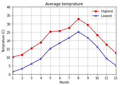
全てを指定してグラフを完成させたバージョン(xaxis.set_ticks関数で\(x\)軸のグリッドの幅を設定しています).
fig, ax = plt.subplots()
ax.plot(x, h, 'ro-', label="Highest")
ax.plot(x, l, 'bx-', label="Lowest")
ax.legend()
ax.set_xlim(1, 12)
ax.set_ylim(0, 40)
ax.set_title('Average temprature')
ax.set_xlabel('Month')
ax.set_ylabel('Temprature (C)')
ax.xaxis.set_ticks(x)
ax.grid()
plt.show()
グラフをファイルに保存する.
fig.savefig('temprature.png')
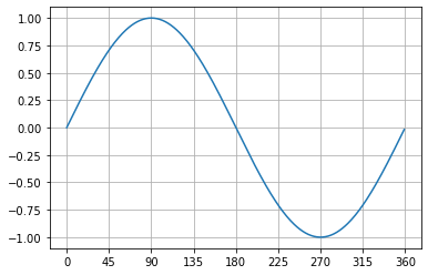
なお,plot関数は軌跡を描く場合にもよく用いられる.以下は正弦関数(\(\sin\))の値をプロットする例.
t = np.arange(0, 360, 1)
s = np.sin(2 * np.pi * (t / 360))

fig, ax = plt.subplots()
ax.plot(t, s)
ax.grid()
ax.xaxis.set_ticks(np.arange(0, 400, 45))
plt.show()
棒グラフ
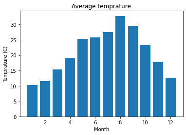
bar関数で棒グラフを描画.
fig, ax = plt.subplots()
ax.bar(x, h)
ax.set_title('Average temprature')
ax.set_xlabel('Month')
ax.set_ylabel('Temprature (C)')
plt.show()
\(x\)軸の値のラベルを指定し,月名を表示する.
months = ['Jan', 'Feb', 'Mar', 'Apr', 'May', 'Jun', 'Jul', 'Aug', 'Sep', 'Oct', 'Nov', 'Dec']
fig, ax = plt.subplots()
ax.bar(x, h, tick_label=months)
ax.set_title('Average temprature')
ax.set_xlabel('Month')
ax.set_ylabel('Temprature (C)')
plt.show()

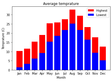
bar関数を繰り返し用い,積み上げ棒グラフを描画.
fig, ax = plt.subplots()
ax.bar(x, h, color="r", label="Highest")
ax.bar(x, l, color="b", label="Lowest", tick_label=months)
ax.legend()
ax.set_title('Average temprature')
ax.set_xlabel('Month')
ax.set_ylabel('Temprature (C)')
plt.show()
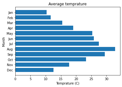
barh関数を用いて,水平方向の棒グラフを描画.以下のコードでinvert_yaxis関数を呼び出さないと,月が下から上の方向に並ぶ.
fig, ax = plt.subplots()
ax.barh(x, h, tick_label=months)
ax.invert_yaxis() # Arange labels top to bottom.
ax.set_title('Average temprature')
ax.set_xlabel('Temprature (C)')
ax.set_ylabel('Month')
plt.show()
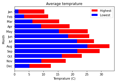
fig, ax = plt.subplots()
ax.barh(x, h, color="r", label="Highest")
ax.barh(x, l, color="b", label="Lowest", tick_label=months)
ax.legend()
ax.invert_yaxis()
ax.set_title('Average temprature')
ax.set_xlabel('Temprature (C)')
ax.set_ylabel('Month')
plt.show()
散布図
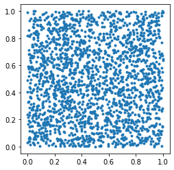
2次元平面上で,\(0 \leq x < 1 \wedge 0 \leq y < 1\)の範囲内でランダムな点を2000個作成し,\(d\)に格納する.
d = np.random.rand(2, 2000)
scatter関数を呼び出し,2次元平面上で\(d\)を散布図として描く(今回はset_aspect関数で縦横比を1:1にしておく).
fig, ax = plt.subplots()
ax.scatter(d[0], d[1], marker='.')
ax.set_aspect('equal')
plt.show()
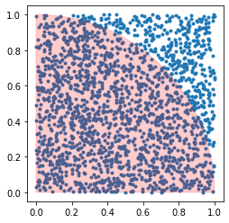
patches.Wedgeクラスを用いて円弧(中心座標は\((0,0)\),半径は\(1\),角度の範囲は0度から90度,alpha引数で透明度を指定)を描き,グラフの上に重ねる.
fig, ax = plt.subplots()
ax.scatter(d[0], d[1], marker='.')
ax.set_aspect('equal')
circle = matplotlib.patches.Wedge((0, 0), 1, 0, 90, alpha=0.2, color='r')
ax.add_patch(circle)
plt.show()
日本語の表示方法
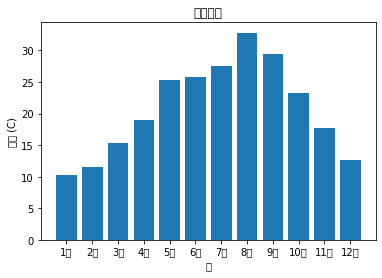
月の名前を日本語表記に変更する.
months = [f'{i}月' for i in x]
months
['1月', '2月', '3月', '4月', '5月', '6月', '7月', '8月', '9月', '10月', '11月', '12月']
また,グラフや軸の名前に日本語を使うと,以下のような文字化けが発生する.
fig, ax = plt.subplots()
ax.bar(x, h, tick_label=months)
ax.set_title('平均気温')
ax.set_xlabel('月')
ax.set_ylabel('温度 (C)')
plt.show()
/home/okazaki/anaconda3/lib/python3.8/site-packages/matplotlib/backends/backend_agg.py:214: RuntimeWarning: Glyph 24179 missing from current font.
  font.set_text(s, 0.0, flags=flags)
/home/okazaki/anaconda3/lib/python3.8/site-packages/matplotlib/backends/backend_agg.py:214: RuntimeWarning: Glyph 22343 missing from current font.
  font.set_text(s, 0.0, flags=flags)
/home/okazaki/anaconda3/lib/python3.8/site-packages/matplotlib/backends/backend_agg.py:214: RuntimeWarning: Glyph 27671 missing from current font.
  font.set_text(s, 0.0, flags=flags)
/home/okazaki/anaconda3/lib/python3.8/site-packages/matplotlib/backends/backend_agg.py:214: RuntimeWarning: Glyph 28201 missing from current font.
  font.set_text(s, 0.0, flags=flags)
/home/okazaki/anaconda3/lib/python3.8/site-packages/matplotlib/backends/backend_agg.py:214: RuntimeWarning: Glyph 26376 missing from current font.
  font.set_text(s, 0.0, flags=flags)
/home/okazaki/anaconda3/lib/python3.8/site-packages/matplotlib/backends/backend_agg.py:214: RuntimeWarning: Glyph 24230 missing from current font.
  font.set_text(s, 0.0, flags=flags)
/home/okazaki/anaconda3/lib/python3.8/site-packages/matplotlib/backends/backend_agg.py:183: RuntimeWarning: Glyph 26376 missing from current font.
  font.set_text(s, 0, flags=flags)
/home/okazaki/anaconda3/lib/python3.8/site-packages/matplotlib/backends/backend_agg.py:183: RuntimeWarning: Glyph 28201 missing from current font.
  font.set_text(s, 0, flags=flags)
/home/okazaki/anaconda3/lib/python3.8/site-packages/matplotlib/backends/backend_agg.py:183: RuntimeWarning: Glyph 24230 missing from current font.
  font.set_text(s, 0, flags=flags)
/home/okazaki/anaconda3/lib/python3.8/site-packages/matplotlib/backends/backend_agg.py:183: RuntimeWarning: Glyph 24179 missing from current font.
  font.set_text(s, 0, flags=flags)
/home/okazaki/anaconda3/lib/python3.8/site-packages/matplotlib/backends/backend_agg.py:183: RuntimeWarning: Glyph 22343 missing from current font.
  font.set_text(s, 0, flags=flags)
/home/okazaki/anaconda3/lib/python3.8/site-packages/matplotlib/backends/backend_agg.py:183: RuntimeWarning: Glyph 27671 missing from current font.
  font.set_text(s, 0, flags=flags)
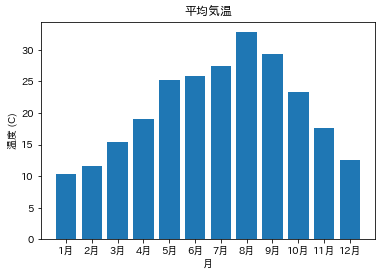
この問題に対処するには,japanize-matplotlibモジュールをインストールし,japanize_matplotlibをインポートすればよい(モジュールをインポートするときに”-“が”_”に置き換わることに注意)
!pip install japanize-matplotlib
Processing /home/okazaki/.cache/pip/wheels/4f/ca/96/4cc5e192421cceb077fbf4ffec533382edd416fd3fa0af0bbd/japanize_matplotlib-1.1.3-py3-none-any.whl
Requirement already satisfied: matplotlib in /home/okazaki/anaconda3/lib/python3.8/site-packages (from japanize-matplotlib) (3.2.2)
Requirement already satisfied: numpy>=1.11 in /home/okazaki/anaconda3/lib/python3.8/site-packages (from matplotlib->japanize-matplotlib) (1.18.5)
Requirement already satisfied: cycler>=0.10 in /home/okazaki/anaconda3/lib/python3.8/site-packages (from matplotlib->japanize-matplotlib) (0.10.0)
Requirement already satisfied: pyparsing!=2.0.4,!=2.1.2,!=2.1.6,>=2.0.1 in /home/okazaki/anaconda3/lib/python3.8/site-packages (from matplotlib->japanize-matplotlib) (2.4.7)
Requirement already satisfied: python-dateutil>=2.1 in /home/okazaki/anaconda3/lib/python3.8/site-packages (from matplotlib->japanize-matplotlib) (2.8.1)
Requirement already satisfied: kiwisolver>=1.0.1 in /home/okazaki/anaconda3/lib/python3.8/site-packages (from matplotlib->japanize-matplotlib) (1.2.0)
Requirement already satisfied: six in /home/okazaki/anaconda3/lib/python3.8/site-packages (from cycler>=0.10->matplotlib->japanize-matplotlib) (1.15.0)
Installing collected packages: japanize-matplotlib
Successfully installed japanize-matplotlib-1.1.3
import japanize_matplotlib
fig, ax = plt.subplots()
ax.bar(x, h, tick_label=months)
ax.set_title('平均気温')
ax.set_xlabel('月')
ax.set_ylabel('温度 (C)')
plt.show()
アニメーション
詳しくは説明しないが,アニメーションを作成することも可能.
import matplotlib.animation
from IPython.display import HTML

frames = np.random.rand(100, 2)

fig, ax = plt.subplots()
ax.set_aspect('equal')
ax.set_xlim(0, 1)
ax.set_ylim(0, 1)

def init():
    circle = matplotlib.patches.Wedge((0, 0), 1, 0, 90, alpha=0.2, color='r')
    return [ax.add_patch(circle),]

def update(frame):
    x, y = frame
    c = 'r' if x ** 2 + y ** 2 < 1 else 'b'
    return [ax.scatter(x, y, marker='.', color=c),]

ani = matplotlib.animation.FuncAnimation(fig, update, frames, init, interval=10, blit=True)
plt.close(fig)
HTML(ani.to_jshtml())
#HTML(ani.to_html5_video())
#ani.save('scatter.mp4', writer="ffmpeg")